Making sense of a whole lot of data.


Deciphering trends in big data is easier when you can see it.
Why
As the amount of data we have grows exponentially, we need to make sense of it. Not only for ourselves, but for our stakeholders as well.
What
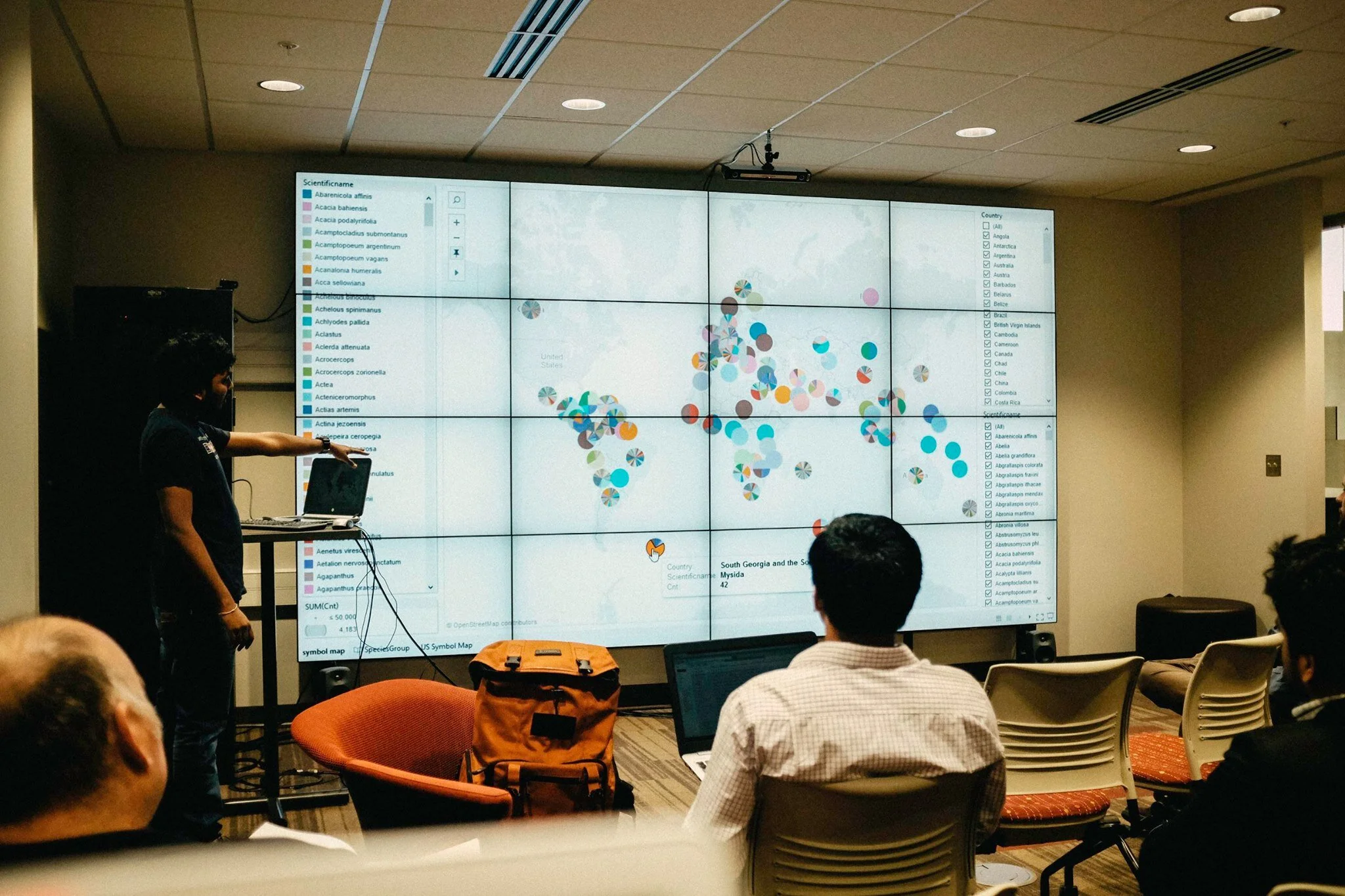
Over 16 weeks I worked with fellow graduate students and doctoral students at Indiana University’s graduate school of Informatics and Computer Science to wrangle big data.

Process
As with all data science, it starts with cleaning, organizing, and sorting data. This part isn’t that fun but it entirely necessary: looking for inconsistencies, getting rid of duplicates, and standardizing formats.
Next, it’s helpful to think about what kind of mapping would be helpful. Do we want to look at the data temporally, relationally, geographically? We often considered the following models:
Network map, Geography map, Scatter plot, Line chart, Bar chart, Heat map.
After doing several explorations, we would test and iterate, looking for connections and testing hypothesis.

Tell a story to stakeholders
Finally, we would style the charts for clear readability and play it back to sponsors and stakeholders, telling the story behind the data.
For our final project, I worked with four other graduate and doctorate students to create this website and associated content for the Millenium Project – striving to learn more about the future today, to help shape a better tomorrow.